



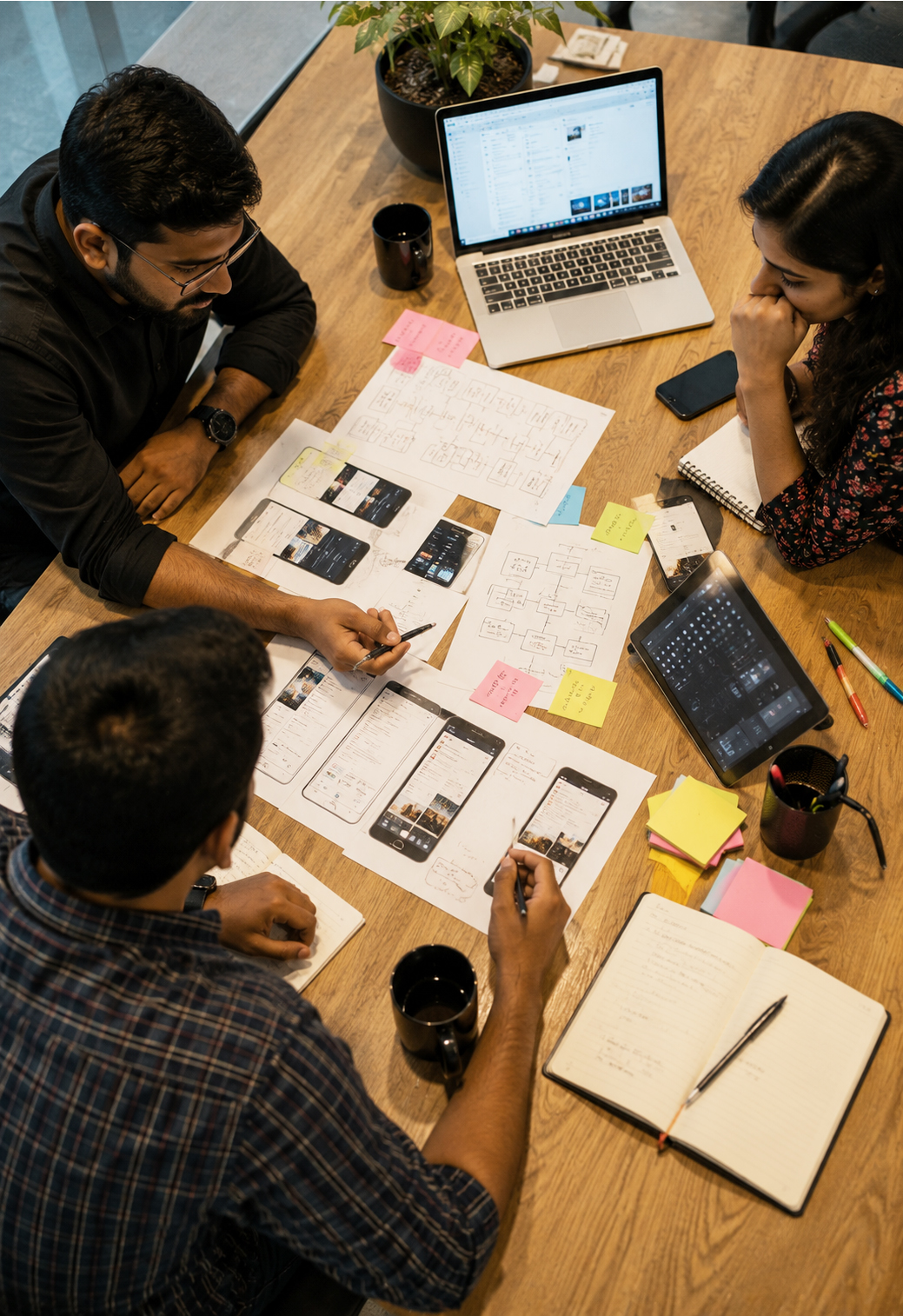







Design That Turns Complexity Into Clarity
We research how people actually work, then design interfaces, products, and systems that make the right action the obvious one.
3Shadz Design & Experience brings UI/UX design, product design, UX research, and design systems under one accountable team, so every screen we ship is grounded in how real users behave, not in opinions about how they should.
Design here is not a polish pass before launch. It runs alongside engineering from the first wireframe, and it is systemized into reusable components and tokens so consistency does not depend on any one person remembering the rules.
- 4 disciplines Research, UI/UX, product & systems design
- Tokens first Every screen traces back to a documented system
- WCAG-aware Accessibility considered from the first wireframe

Design Is the First Line of Code Your Users Actually Read
Before anyone reads your feature list, they read your interface, and they draw conclusions about trust, competence, and effort within seconds.
Confusing layouts, inconsistent components, and unlabeled controls do not feel like design problems from inside a growing engineering team. They feel like small compromises made under deadline. Left alone, they compound into support tickets, abandoned flows, and a product that is harder to sell than it should be.
Our approach starts with the same question in every engagement: what is the person on the other side of this screen actually trying to do? Research answers that question, design turns the answer into an interface, and a design system makes sure the answer stays consistent as more people build on top of it.
We treat design as an engineering discipline, not a creative afterthought: documented, testable, and built to hand off cleanly to the developers who ship it.
Four Disciplines, One Accountable Design Team
Each discipline stands on its own as an engagement, and each one gets stronger when combined with the others.
UI/UX Design
We design interfaces and interactions that are intuitive, accessible, and aligned with how your users actually work, from the underlying flow to the pixel that sits on screen.
- Wireframing & information architecture
- High-fidelity UI design
- Interaction & micro-animation design
- Accessibility-aware design (WCAG)
- Responsive design across breakpoints
- Usability validation before build
Product Design
We shape digital products end-to-end, from early concept and flows to polished, launch-ready screens, staying involved through build rather than handing off a static file.
- Discovery workshops & problem framing
- User flows & journey mapping
- Concept exploration & rapid iteration
- MVP-focused screen design
- Design-to-development handoff
- Ongoing design support post-launch
UX Research
We study real user behavior and feedback to guide design decisions with evidence instead of guesswork, before a redesign starts and after it ships.
- User interviews & contextual inquiry
- Usability testing (moderated & unmoderated)
- Surveys & behavioral analytics review
- Persona & journey mapping
- Card sorting & IA testing
- Research-backed design recommendations
Design Systems
We build reusable component libraries and design standards that keep products consistent as teams scale, so consistency is a default, not a code review argument.
- Design tokens (color, type, spacing, motion)
- Reusable component libraries
- Documentation & usage guidelines
- Figma & code library alignment
- Governance & contribution workflow
- Rollout across existing products
Six Principles Behind Every Screen We Design
Not a style guide: the working beliefs that settle arguments when a design decision is not obvious.
Clarity Over Cleverness
If a user has to pause and interpret an interface, the interface has already failed. We design for the fastest correct understanding, not the most original layout.
Consistency Builds Trust
The same action should look and behave the same way everywhere it appears. Inconsistency reads as carelessness even when the underlying product is solid.
Accessible by Default
Contrast, focus states, and keyboard navigation are part of the first draft, not a checklist run before launch. Designing for edge cases makes the core experience better for everyone.
Content Leads the Layout
We design around real copy, real data, and real edge cases (empty states, long names, loading states), instead of polishing a layout that only works with placeholder content.
Feedback for Every Action
Every click, submission, and error should tell the user what just happened. Silence is the most common source of support tickets we see in interface audits.
Designed to Scale
A screen that only works as a one-off costs more the second time someone needs something similar. We design components, not just pages.
The Same Product, Redesigned With Intent
A typical unstructured interface, next to a version shaped by hierarchy, spacing, and a documented design system.


What typically changes: a clear visual hierarchy, consistent spacing and type scale, higher-contrast text, grouped related actions, and components pulled from one documented system instead of rebuilt per screen.
From Open Question to Developer-Ready Screens
The same six stages apply to a focused redesign and a multi-product design system, only the depth of each stage changes.
-
01
Discover
We study your users, current product, and the problem worth solving before proposing a direction.
-
02
Define
Flows, information architecture, and success criteria are agreed before a single pixel is placed.
-
03
Design
Wireframes move into high-fidelity screens, explored in variations rather than a single guess.
-
04
Prototype & Test
Interactive prototypes are tested with real users, and findings are folded back before build.
-
05
Handoff
Structured Figma files, specs, and component states are delivered in a form engineers can build.
-
06
Measure & Iterate
We review usage and feedback after launch and feed what we learn back into the design system.
A Design System Your Team Can Actually Maintain
Not a Figma file nobody opens after month two: a documented set of tokens and components that design and engineering both treat as the source of truth.
We build design systems around tokens rather than fixed values, so a color, spacing, or typography change propagates everywhere it is used instead of triggering a manual screen-by-screen update.
Every component ships with documented states (default, hover, focus, disabled, error) and clear usage guidance, so new screens are assembled from what already exists instead of designed from a blank canvas.
Explore Design SystemsChosen Around Your Workflow, Not a Fixed Toolkit
Figma is home base for most engagements. The rest is selected based on the research question, the prototype fidelity needed, and how your team already works.
- Maze
- UserTesting
- Dovetail
- Miro
- Notion
- Google Forms
- Optimal Workshop
- Figma
- Adobe XD
- Sketch
- Adobe Illustrator
- Adobe Photoshop
- Framer
- Figma Prototyping
- Framer
- Principle
- ProtoPie
- After Effects
- Lottie
- Figma Variables
- Tokens Studio
- Storybook
- Zeroheight
- Zeplin
- Style Dictionary
- Hotjar
- Microsoft Clarity
- Google Analytics
- Lookback
- UsabilityHub
- Amplitude
What Comes With Every Design Project
These are not add-ons priced separately later. They are how we work.
Discovery Workshops
Structured sessions that surface goals, constraints, and assumptions before design starts.
Information Architecture
Content and navigation structured around how users think, not how the org chart is organized.
Accessibility Review
Contrast, focus order, and screen reader behavior checked against WCAG 2.1 AA as a baseline.
Interactive Prototypes
Clickable prototypes that let stakeholders and users react to a flow before code is written.
Usability Testing
Sessions with real users that turn assumptions into observed behavior and specific fixes.
Developer Handoff
Structured specs, redlines, and component states delivered in a form engineers can build from.
Design QA During Build
We review implemented screens against the design so what ships matches what was approved.
Post-Launch Design Support
Design stays available after launch to refine flows as real usage reveals what to improve.
Design Work Across Industries
The interface changes with the industry. The discipline behind it does not.
Healthcare
Patient-facing and clinical interfaces designed for clarity under pressure.
Banking & Financial Services
Dense financial data made scannable without hiding what compliance requires.
Retail & E-Commerce
Browsing, cart, and checkout flows designed to reduce friction at every step.
Education & EdTech
Learning interfaces designed for focus, across a wide range of ages and devices.
Travel & Hospitality
Booking and guest experiences designed to feel effortless under time pressure.
Real Estate
Listing and portfolio interfaces that make large amounts of imagery and data usable.
Marketplaces & Platforms
Multi-sided experiences designed for buyers, sellers, and admins at once.
Startups
Lean, testable design that helps a first version earn its next round of feedback.
Research-Led, Not Opinion-Led
Design decisions are traced back to a user need or a test finding, not a personal preference.
One Team, Four Disciplines
Research, UI/UX, product design, and design systems work together instead of across vendors.
Built to Be Engineered
Every file is structured for handoff, because a design that cannot be built cleanly is not finished.
Accessibility as a Default
Inclusive design is part of the review from day one, not a retrofit before an audit.
Systems Thinking
We design components and tokens, not one-off screens that fall out of sync the moment they ship.
You Own the Files
Figma files, prototypes, and documentation are handed over: you are never locked out.
A Design Partner Embedded in the Build
Great design work that lives only in a handoff document rarely survives contact with a sprint deadline. We stay close to engineering through build, review implemented screens against the design, and treat the design system as a living product, not a one-time deliverable.
Design Works Best Connected to Everything Around It
Research and interface work reinforce, and get reinforced by, the engineering, data, and infrastructure disciplines around it.
Design + AI & Intelligent Solutions
Design the interaction layer for assistants, agents, and AI-powered features people can trust.
Explore AI & Intelligent SolutionsDesign + Software Engineering
Hand off design systems that map directly onto the components your engineers actually build.
Explore Software EngineeringDesign + Data & Analytics
Pair qualitative research with product analytics so redesign decisions are backed by both.
Explore Data & AnalyticsDesign + Quality Assurance
Design QA against implemented screens so what ships matches what was approved.
Explore Quality Assurance & SupportDesign + Technology Consulting
Fold UX findings into the roadmap conversations that decide what gets built next.
Explore Technology ConsultingSee All Services
Review the full set of 3Shadz services and how design fits into the wider delivery picture.
Explore All ServicesDesign & Experience FAQs
It is the umbrella for four connected disciplines: UI/UX design, product design, UX research, and design systems. Instead of treating these as separate vendors, one team carries a product from research through interface design to a documented, reusable system.
UX design is the structure underneath a product: the flows, information architecture, and decisions about what happens on which screen. UI design is what those decisions look and feel like on screen: layout, typography, color, and interaction detail. Good products need both working together, which is why we do not split them across separate teams.
Both. We run research as its own engagement (usability testing on an existing product, discovery interviews before a build starts, or a heuristic review of a live product) and we also fold research into ongoing design projects so decisions stay grounded in evidence.
A design system is a documented set of reusable components, tokens, and usage rules that keep a product visually and behaviorally consistent as more people build on it. It is usually worth building once a product has more than one designer, more than one squad shipping UI, or a growing gap between design files and what actually ships.
Yes. We design with your existing frontend stack and component conventions in mind, hand off through structured Figma files with documented states and specs, and stay involved through build for design QA, so what ships matches what was designed.
Accessibility is considered from the first wireframe rather than checked at the end: color contrast, keyboard navigation, focus states, semantic structure, and screen reader behavior are part of the design review, with WCAG 2.1 AA as the working baseline.
We move through discovery, definition, design exploration, prototyping and testing, developer-ready handoff, and post-launch measurement. The depth of each stage scales to the project: a focused redesign moves faster than a multi-product design system.
Most of our design work is on existing products. We typically start with a usability and heuristic review of what exists today, so a redesign fixes proven friction points instead of changing things for the sake of change.
Figma is our primary design and design-systems tool, supported by tools such as Adobe XD, Framer, Maze, Hotjar, Storybook, and Zeroheight depending on the engagement: chosen around your team's existing workflow rather than a fixed toolkit.
A focused product redesign or a new application's core flows typically runs a few weeks per major flow, while a full design system spans longer as components are documented and rolled out. We scope in phases so usable design work reaches your engineers early.
You do. Figma files, prototypes, design tokens, and documentation are handed over under terms agreed before work begins, so you are never dependent on us to access or edit your own design assets.
Share the product, the users, and the problem you are seeing, confusing navigation, low adoption, an inconsistent interface, or a system you are launching without one. We will recommend where to start, whether that is research, a focused redesign, or a design system.
Show Us the Screen That Isn’t Working. We’ll Tell You Why.
You do not need a finished brief to start a conversation. Tell us about the flow users abandon, the interface that has outgrown its original design, or the product you are about to build without a design system behind it. We will help you define what to research, what to redesign first, and how to hand it to engineering in a form that actually ships.